VISUALIZATION PART II – IS A PICTURE WORTH A 1000 CELLS IN A SPREADSHEET?
/
Only if it’s an entry point to effective decision making and action… The point of visualization is to help us make sense of complex data and relationships. The iVistra example in the prior post illustrates how one firm links sensors to organizational metrics to support peoples’ ability to know what’s going on, and how to make better decisions as a result. Thinking about these issues led me to wonder about the best forms for this visualization.
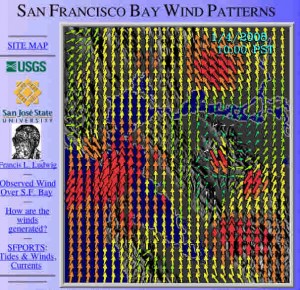
The following are notes from my initial foray into the topic. The wind picture above is a personal visualization favorite (fat red arrows are +25 knots of wind).
Cognos’ (an IBM company) whitepaper “Picturing Performance: Dashboards and Scorecards with Cognos” was a great start. They summarize Wayne Eckerson’s work noting that there are three dashboard applications (monitoring, analysis, & management), three layers of information (graphical, abstracted – to focus on key performance metrics; summarized dimensional data -- for addressing root causes; and detailed operational data – that help to identify resolutions), and three types of dashboards (operational, tactical, and strategic). So, the best forms of visualization will match the particular goal being sought.
Rachel Bellamy and her colleagues at IBM write that “a visualization should be thought of as a user interface to a control task, not as a report.” I think that’s the biggest issue – the pretty picture isn’t the end, the pretty picture is the welcoming entrance into a relationship with the underlying data. And, like all relationships, need to evolve to survive.
Bellamy et al. draw from Card, Mackinlay, & Shneiderman’s book, "Readings in Information Visualization: Using Vision to Think" to suggest that visualizations should increase people’s visual capabilities and amplify cognition. They note that Card et al. outline six visualization benefits:
- Increasing the users’ memory and processing resources
- Reducing the search for information
- Enhancing pattern detection
- Enabling perceptual inference
- Using perceptual attention mechanisms for monitoring
- Encoding information in a malleable medium
I don’t yet have a copy of the Card book (it’s coming via Interlibrary Loan), but I do expect that they will talk about how even the best visualization tools provide only possibilities, and that these are turned into results when effectively integrated into the work process. No silver bullets.
These six benefits suggest that the “form” question is not one of pie chart versus line graph, or stoplight versus gauge (this point is made by most of the authors in my review, many harkening back to Edward Tufte’s work). Rather the issue is matching the visualization to how people will perceive the situation and be able to act on the information. Guidance on this matching has a broad foundation. We have fine-grained research published psychology journals (for example on “change blindness” – people’s difficulty with noticing change); user interface research like that published in human-computer interaction journals and practitioner focused work such as described in Stephen Few’s blog. All of these sources suggest that there is no easy approach, but that thoughtful application may provide significant benefit.
In Part III I’ll return to one of my own areas of research and review recent work on visualization for team collaboration.


